02:03

Questionnaire Results and Analysis


Through the use of a questionnaire I have found various objections to my past plans for the magazine. I had produced a 10 person questionnaire consisting of 10 questions in which I have now been able to base my magazine production on. I have thoroughly examined the questionnaire in which my original plan has been objected by certain answers. One point can be taken in to consideration, however, and may show bias, is the fact that 70% of the people who partook in the questionnaire where male

The questionnaire that I have carried out may also show some certainty in the results due to the fact that 60% of people regularly read magazines. This therefore means that these people will have more of a certainty in what they want to see in a successful magazine. However, there are some complications due to the fact that 50% of them only purchase magazines from time to time.

On the basis of the magazines genre 70% of them said that they listen and are interested in the Rock genre. Even though I only carried out the questionnaire on ten people, it gives me some certainty that the genre is v=ry popular with audiences and should be the main focus of the magazine. Through the questionnaire I have also determined what title, for the magazine, is most popular with audiences as the two that I had suggested were based on two different genres. This in turn helps my decision when naming the magazine. I also determined that both new and old artist’s articles are popular with audiences with the results coming back as 50-50.


However, there were some complications in my questionnaire. For example, 70% of people said they wish the magazine to be priced between £1.30-£1.50. The magazine could be produced at this price; however, 60% wanted a wide range of graphics which would result in a higher cost of the magazine. This creates problems for the analysis of the questionnaire.


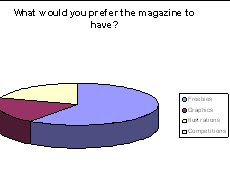
I have also examined what most readers like to see in a magazine. Through my questionnaire it is shown that 60% of readers prefer the magazine to contain freebies.


11:54

Preliminary Task - Contents Page Analysis


When creating my College magazine Contents Page for my preliminary task I aimed to follow some aspects of magazine conventions. When creating the contents page I used the following:

Page References
Images to represent parts of the magazine content
Bold sub-titles for pieces of content
Bold title, Top centre
Contrast in colour. Colour is used to present areas the magazine feels the reader should see.

However there are many aspects of a magazine contents page that I did not use in my preliminary task. I will use the following when creating my contents page due to lack of it in my preliminary task:

Editor’s Message
Wider Variety Of Images
Wider Variety of Font Styles
Professional Layout
Bolder Title. More visible to reader.
Cropping or cutting of images to add effect or professionalism.

11:48

Preliminary Task - Editing Of Front Cover Image

When creating a front cover for my college magazine (preliminary task) I edited certain areas for extra effect. I edited my central image using the following steps:

1) Open the intended image on Adobe Photoshop and select the area of concentration:

When editing my central image I took out the main part of the original image which enabled me to edit the image more freely. This is done my selecting an areas which you wish to use and then selecting the tabs Edit > Cut.


2) Open up new file and zoom in on area of concentration:

When opening a new file you select File > New. And then Edit > Paste to place the image which was cut. After this you will have to zoom on the area which you wish to edit by doing the following: 1) Selecting the zoom tab. 2) Clicking on the area on concentration until it is zoomed in as much as needed.


3) I have chosen to edit my central image by changing the colour of the eyes to add extra effect to the image. This I done by: 1) Selecting the area for editing by using the magic wand tool. 2) Using the brush tool and the colour of choice to change the colour of the image.


When the editing is completed you simply save the file and open Adobe Illustrator and select File > Place to create a file using illustrator.


11:02

Preliminary Task - Front Cover Analysis


When creating my College Magazine front over for my preliminary task I aimed to follow some aspects of magazine conventions. When creating the front cover I used the following:

A bold visible title at the top centre of the page.
The use of price and date tags at the top of the page.
Use of puffs, buzz words and anchorage text.
The use of page references.
Freebies, Extras etc.

However there are many aspects of a magazine front cover that I did not use in my preliminary task. I will use the following when creating my front cover due to lack of it in my preliminary task:

A well designed and thought about image, which will be cropped and cut to look professional.
A bolder title so that it stands out more to the reader.
Adapt the layout of a front cover of a magazine. At the moment it is reminiscent of a newspaper.
Improve puffs, buzz words and anchorage text so that they sound more professional, a place them more appropriately.
Add a barcode and issue number.
Use different fonts and colours. They should be arranged more professionally!

10:21

Double Page Spread Analysis Part 2


10:18

Double Page Spread Analysis Part 1


14:16

Evolution Of Britney Spears Part 3


This image is used for a specific reason. The magazines main aim with this image is to show he distress and current life affairs of Britney Spears. The magazine uses the close up successfully so that the reader is able to interpret the body language of the person in question. It also gives the reader an idea of what is to be contained in the magazine, and gives them reason to continue reading. The use of black and white is very significant in this image, due to the fact that Britney Spears has been overwhelmed with unwanted media attention due to her current life affairs which include dealings with drugs and alcohol. The use of black and white brings out the distress and desperateness for help that Britney is aiming to present to the reader.
This image has been cropped so that the image is transformed into a close up. This enables the audience to interpret the body language of Britney. This image has been cropped successfully for many reasons including the fact that it shows the growing troubles of Britney’s life.
Britney presents herself as wanting to develop a fresh and new relationship with the reader due to her current life affairs been a bad influence on all of her audience/fans. She can also be seen as asking for forgiveness due to her facial expression which shows distress and depression. This can also be backed up through the anchorage text which states, ‘Inside an American Tragedy’. This implies that Britney wants to develop a fresh and new relationship with the reader by first telling of her life and accepting the mistakes which she has made. Through accepting her mistakes the reader may be led to forgive Britney, which makes the image successful in reaching its purpose.

14:14

Evolution Of Britney Spears Part 2


This image has been framed/cropped to present the image that Rolling Stones and Britney are aiming to present. One could imply that this magazine connotes sex appeal; however 40% of Rolling Stones readers are female. Taking this into consideration, Britney can be seen as wanting to express another side of her. It is evident that she is being quite playful to the male eye. However to the female audience she is showing that you don’t have to fully expose yourself in a image to gain popularity. This can be seen through certain props such as the cotton underwear. The type of shot that the magazine uses is a medium long shot.

Britney’s pose can be seen as being quite playful. It can be assumed that her costume is constructed to attract a wider male audience. However, Rolling Stones has 41% female audience, which then backs up my earlier point of Britney being quite playful rather than sexual. The idea of Britney being playful is evident through her exposure. For example, Britney is well covered up in the image. She also uses cotton underwear which could suggest that she is not aiming to attain a sexual image. However, is Rolling Stones was aiming to promote Britney to a male audience, then, they have used conventions in the image which are regularly associated with men’s magazines. Through examining her facial expressions it can be seen that Britney is showing innocence. Unlike the first cover, Britney chooses an expression which is less sexual and less submissive.
The setting is reminiscent of a bedroom, due to the use of the bed sheets. This could further connote Britney’s playful side, in that she uses the setting of a bedroom to add more emphasis to her teasing demeanour.
The lighting is used effectively in order to show Britney in the view of what the reader will preferably want to see. For example there is lighting particularly concentrated on the parts of Britney which will be viewed in particular by the audience. There is also a large concentration of light on Britney’s hair to show the colour of her hair. This could connote how ‘bright’ she really is, whether that be in the music industry or not.
White is a predominately used colour throughout the cover. This can be used as reference to the bedroom setting where white is a predominately used colour. It may also be used for to add emphasis on the lighting effect, so that Britney is more visible to the reader so that she shines out on the page. The other use of black, white and red is reminiscent of the American flag. This could imply to the reader that Britney is aiming to show her All-American persona.

14:12

Evolution Of Britney Spears Part 1


This image has been cropped closely so that Britney is shown for a purpose. This type of frame can be used to create more sex appeal or to add extra effect on what the magazine is aiming to promote. Rolling Stones and Britney Spears are working together through this magazine to gain higher popularity levels for themselves. Rolling Stones wants to use Britney as there cover girl due to her current rise in status, whereas Britney wants to be on the front cover of a world renowned magazine to gain higher popularity and status. This image uses the mid-long shot to show Britney. Also, the fact that the camera is looking down on Britney gives the reader a sense of dominance over her. However, even though Britney can be interpreted as creating sex appeal, she is actually being quite submissive in allowing a male gaze. However there is great controversy which is tagged with this photo. Due to the fact that Britney was only 17 at the time, there were negative connotations carried with the photo. The photo and background meant that the image was to gain unwanted growing publicity from the media due to its shocking and provocative nature.
Through examining Britney’s costume it can be interpreted that Britney is either a teenager or aiming at teenagers. Her image is seen as expressive and shows her ‘naughty’ side. Britney seems to be appealing to a range of ages. Through the use of these costumes, many different age groups and sexes are attracted by the magazine. An example is her lack of clothing which defines her ‘naughty’ side, which could attract a larger male audience. This would be successful for Rolling Stones as their main target audience is male of around the age of 20-30. Also, through the use of a collared shirt Britney shows her schoolgirl act, which could then attract teenage girls as they could see Britney as someone to relate to. This is also an inter textual reference to her debut single ‘hit me baby one more time’.
In these images the magazine has used certain props such as the telephone to convey age differential. For example, the use of the phone softens up the picture and makes it more playful than keeping it to sexual. Also, the use of the tele-tubby expresses her childish and sensitive side. Through the use of these props Britney is able to play on the stereotype of a teenager.
The setting of this image is on a bed. This image is reminiscent of many teenage girls seen in movies whom are talking consistently to their friends on their beds in a relaxed way. Britney expresses all of these connotations in this image. Also, if you were to think of Britney as a schoolgirl (due to her costume) this could imply that Britney is expressing the average life of any teenage girl after school. Therefore, it is ok to look at her, due to what she is expressing.
The inter textual reference being referred to here is that of the film ‘Lolita’. This is an inter textual reference to the schoolgirl image of Lolita where a young girl aims to seduce men. Britney presents the schoolgirl image in both this image and her single ‘hit me baby one more time’.
The magazine implements a darkish pink colour in the background of this magazine. This could be used to express the more mature side of Britney, showing her audience that she is not just any ordinary schoolgirl or a schoolgirl at all. However, if the magazine was to use a light pink colour it would lead the reader to believe that Britney is still just a child who wishes not to be. This would have a negative effect on the central image.

13:00

Clash Contents Page Analysis


Through examining the layout of the Clash contents page it can be seen that the layout is reminiscent of the back of a CD cover. In terms of the way in which the writing and images is placed. For example, regularly a CD back cover would have a central images with text often placed out such as that of Clash magazine. It could imply that the magazine is aimed at many different audiences through the fact that the contents is laid out specifically in different sections. Perhaps to state a change in genre. This could include anything from R’n’B to rock.

Due to their covering of a wide range of genres Clash is able to draw in a wide audience that could include any age from teenagers to adults of any age. Due to the layout it could imply that the readers are particularly older than that of Kerrang and NME due to the fact that it contains less images and colours which a younger audience finds attractive, whereas an older audience likes to get straight to the point.


The central image is reminiscent of Jesus, through his body language, stance and hair. This could imply that Clash is either dominant or that it has control etc. Therefore, this could back up the reason for their covering of a range of genres and how successful it is.

It is different to NME and Kerrang for several reasons. For example Clash is aimed at a range of genres unlike the above. It also introduces a different style of layout which is not reminiscent of NME or Kerrang which has what you could call a consistent layout. Another point to consider is the fact that the layout of images is not the same in that Kerrang, for example, uses images to describe or present a specific piece of content where as Clash just simply labels the piece of content with a brief description.Also, the content on this page is not fully emphasised like Kerrang and NME. Fro example, Kerrang would use a range of colours and fonts to emphasis a piece of content whereas Clash just simply places content in to a specific area according to topic. However, unlike Kerrang and NME, Clash’s content page is much more descriptive and accessible due to the lack of images, font and colours. It is set out in sections that enable the reader to easily access a piece of content.

12:58

Kerrang Contents Page Analysis


The magazine uses a range of different images to represent the specific piece of content. Theses images have been constructed so that they are in connection with the specific area of content. For example, when a piece of content is shown there is an image behind or next to it to give the reader an idea on who the person/s is. As seen on this contents page there is an image of an album related to the specified genre which is representational of an area of content which is described in the page. Also, there are certain images which the magazine believes is important and needs to be emphasised. For example, the central image on this contents page is of ‘Biffy Clyro’, obviously the magazine is aiming to promote or emphasise them for a specific reason. This may be due to the fact that they are a new up and coming band as specified or the fact that they are very popular amongst Kerrang’s audiences. They original findings which I carried out on Kerrang magazine. Due to the fact that it uses specific images to represent a story or piece of content.

Regular colours and font are used in this contents page. Which is in cohesion with the Kerrang front cover? It consistently uses the colours black, red and yellow, which could see the rock industry as acting as a semantic field. It uses a regular font to describe certain issues but will however, use different font sizes to emphasise a certain point. For example, the phrase ‘This Week’ is emphasised. Also, the font and colours are used together to promote sub-tiles. For example, in the ‘This Week column the sub-titles are presented in black and yellow to emphasise an area of content. This method is also used with the images where the content page numbers are presented in black and yellow to create a stand out effect. This also supports the style of the front cover which also uses the same methods to publicise content.

The information is organised successfully so that it is accessible to the audience through using syntax. For example, when a piece of contents is described there will be a sub-message below to describe the particular piece of content. Also, the use of the ‘This Week’ column is effective as it organises all the different pieces of content in to their related topic. This enables the reader to access certain pages easily without the need for flipping pages. Moreover, pages with no related topic, or pages that need emphasis are placed central on the contents page with images so that they are noticed by the reader. This therefore makes pages that are of significance accessible to the reader which is a convention that successful magazines adapt. The different sections are set out through the contents to give descriptions of what the reader is to find in the magazine.

There are promotional features seen in the contents which can be seen in the bottom right hand corner. The promotion is to subscribe to the magazines next issues. It states the cost and amount of issues you will receive. This is effective in that it gives the reader the accessibility to purchase other magazines without the need for shopping.

The magazine logo can be seen in several images on the contents page. However it is not a dominant image due to the fact that it is only noticeable on front cover images. Although, it may appear dominant to some, where it is placed next to the editors’ message. This is not very effective due to the fact that the reader will not noticeably see the logo, and therefore it is not dominant and has no effect.

There are no other brand franchises present on the contents page. However this does not mean that the brand doesn’t have any other franchises as this could be seen further on in the magazine. However the term ‘K’ as a franchise is often referred to on the front cover which implies Kerrang but could also infer another franchise.

12:55

NME Front Cover Analysis


This type of magazine is identified as that of the rock genre/industry. This can be seen evident through the central image which is of the Scissor Sisters whom are related to that particular genre. They are tagged to this genre due to their releases, body language and costumes. From the front cover it is evident that the magazine will cover a wide variety of articles and issues. The articles that are evidently covered are that of the Scissor Sisters. It also covers extra articles which may not always be covered in the magazine. There are other articles and issues evident through the effective use of certain devices. These include puff, anchorage text and buzz words.

The target audience can be seen evident through the methods and devices that the magazine uses. It can be interpreted that the audience will be set at young adults with an age range of around 13-25. This can be seen through the use of certain graphics and the use of extras which attract a younger audience who enjoy freebies.

Through the central image it can be interpreted that the group are presenting a message of certainty and desire. By examining the anchorage text the message been sent can be fully backed up. The anchorage text states ‘Were the new saviours of rock’n’roll’. The group then show this thought through body language and facial expressions. For example, the central group member points to the reader with a message of determination and certainty.

This tells us that the band want to develop a strong relationship with the reader which presents them as the band of the future. It aims to connect with readers so that they are noticed more evidently throughout the industry, thus, promoting themselves.

The Scissor Sisters are apparent on the front cover on the magazine. They are apparent on the magazine to promote themselves due to their character not been so evident with the readers. Through promoting themselves on the front cover they are able to connect with the reader.

The anchorage text on this front cover states, ‘Were the new saviours of rock’n’roll’. This implies the artists are a new up and coming band. They wish to promote themselves as the saviour to the rock genre, which they believe is not strong at this point in time. The anchorage text is also there to grab the target audience’s attention. If the audience see that there are new articles in the magazine with a group that is not regularly covered then they will be drawn towards it.

The title of this magazine implies many things. Through looking at the title it can be interpreted immediately that the magazine will be aimed at rock fans. This can be seen through the use of colours in the title which is black and red. These are colours which are regularly used by the rock industry and will therefore carry certain connotations with it to imply that it is a rock magazine.

The full name of the title is ‘New Musical Express’. This carries several connotations with it, for example, the fact that this magazine is aiming to promote the latest music in the charts that is associated with the magazines music genre. The word ‘express’ adds extra emphasis to the title as it implies that the new is somewhat fast or can be delivered quickly etc. The title of ‘NME’ also can be interpreted as saying enemy which can be interpreted to mean that the magazine is an enemy of someone or something, that of which is not specified in the title. It could imply that the magazine is an enemy of any challenging magazine cover; however, this is not backed up.

The puff words present in this magazine is, ‘Extra!’ This shows the magazine will be aiming to attract an audience of around 13-25 due to the fact that most readers of this age group are attracted by extras in a magazine. It is also a value for money which most people of this age are attracted to.

The colours black and red are used regularly throughout the front cover of the magazine. It can be seen as attractive to those whom are interested in rock as they are two colours which are regularly used in the rock genre/industry. Different types of font are used for different meanings. For example, the magazine font appears in bold when aiming to grab the reader’s attention or to emphasise a point. The magazine also uses smaller font to describe what a puff or anchorage text is talking about.

Overall the magazine uses many successful methods in order to attract the audience of which it is intended to. It uses strategies such as the use of graphics, colours, font sizes, puff, anchorage text, imagery etc. These can be outlined as very successful in drawing attention to the audience due to the age specification. Also, through the several connotations that the title comes with, the reader is able to interpret what kind of magazine it is, and what the magazine is to contain.

12:53

Kerrang Front Cover Analysis


This type of magazine is that of a rock genre intended for people whom listen and are interested by rock music and background. From the front cover we can interpret that the issues that are to be dealt with in this magazine will be about My Chemical Romance and what effects audience hatred has on their morale. We can also interpret that a number of different issues will be dealt with through the use of puffs, anchorage text etc. From the front cover many different articles can be found for example, there is going to be an ultimate review on topics concerned wit the rock industry during the 2006 era.


The target audience for this magazine are people who are interested in the rock genre/industry. This can be seen evident through the use of certain groups whom appear on the front cover. For example, My Chemical Romance is evidently a rock band, due to the props, i.e. they are all wearing black to blend in with the magazine, they also have that gothic edge to them through their body language and hair styles, and Kerrang is best known for its coverage of rock music and live events. Quite evidently it can be interpreted that the magazine is aimed at a young audience, preferably 13-25, through the use of such things as amount of graphics, and the types and boldness of font. Evidently the magazine is intending to immediately draw their target audience’s attention which is a key element of any successful magazine. Also, age can be considered when you think about the typed issues that are covered on the front cover. For example, younger readers are interested in extras, whether range from exclusive stories to freebies. Kerrang covers this evidently on the front cover and uses a bold font and non-contrasting choice of colours. For example, where it says ‘plus’ the phrase is produced in bold, and the colour is placed in red to coincide with the yellow background. This creates a stand out effect.


Through analysing the central image it can be evidently noticed that the direct mode of address is to show confidence and no fear. This point is backed up by the use of the phrase ‘It’s okay to hate us’. The group My Chemical Romance is aiming to promote the point that they show no remorse towards there audiences jibes and through their facial expressions give a sense of morality and integrity.


This tells us that the group want to develop a strong relationship with its audiences by reassuring them that the taunts are both unnecessary but heard. It aims to develop a relationship with its reader that they are confident and are not people whom give in to taunts. It gives the reader a sense of heroism, as the reader may be inspired by the way in which the band have approached the situation.

My Chemical Romance is used as the central image on the front cover of this magazine. It is appearing on the front cover as it is a ‘reader’s poll special’. This can mean that the magazine is aiming to build a strong fan base by attempting to listen to their audience’s opinions. They could also be apparent due to their popularity. Seeing as their image is central, it could be like this to grab the reader’s attention.

The anchorage text on this front cover states ‘it’s okay to hate us’. This implies that the artists are confident and are respectful. Through the anchorage text we can interpret that the artists are not afraid of taunting from their various audiences.

The title of this magazine connotes many things. Through looking at the title it can be interpreted immediately that the magazine will be aimed at the rock genre. This can be seen evident through the use of graphics. Such as, the fact that the title is reminiscent of shattered glass. This does not immediately imply that it must be tagged to the rock genre, however, shattered glass is predominately seen in several music videos of this particular genre. Also, to add emphasis, the magazine as used the phrase ‘life is loud’. This stands out due to the fact that it is in a different colour compared to the title. This could imply that the magazine wants the reader to notice this, mainly, due to the fact that instruments of this genre are particularly loud unlike of genre instruments.

The puff word in this magazine is the 2006 ultimate review. This implies to the reader that there will be a review on the events of 2006 in the rock industry. The puff word is very unique; it is also predominant over many other phrases on the page, due to the fact that it is on a grey background. A colour that is only used once on the cover, making it unique. This may draw reader’s attention as it is unusual but also stands out. It also uses a unique bold font which is not evident anywhere else on the cover.

The colours black and red are used regularly throughout the front cover of the magazine. It can be seen as attractive to those whom are interested in rock as they are two colours which are regularly used in the rock genre/industry. Different types of font are used for different meanings. For example, the magazine font appears in bold when aiming to grab the reader’s attention or to emphasise a point. The magazine also uses smaller font to describe what a puff or anchorage text is talking about.

Overall the magazine uses many successful methods in order to attract the audience of which it is intended to. It uses strategies such as the use of graphics, colours, font sizes, puff, anchorage text, imagery etc. These can be outlined as very successful in drawing attention to the audience.

12:45